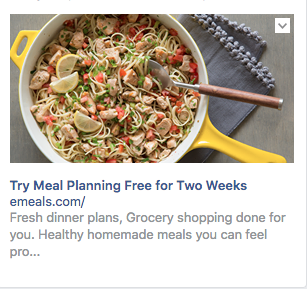
I clicked on the emeals advertisement on Facebook. It was picturing a delicious meal. The first time I clicked on it the image showed some tacos that made my mouth water they looked so good! When I went back to Facebook to take a picture of the advertisement it had changed and the food in the new pictured also looked good but it didn’t appeal to me as much as the tacos did. I love the article that they have for their advertisement. The colors are bright and friendly, purple and green. The layout of the page is broken into sections as you scroll throughout the website vertically, they’ve done this so it is easily responsive for smart phones which is a very important part of any website.
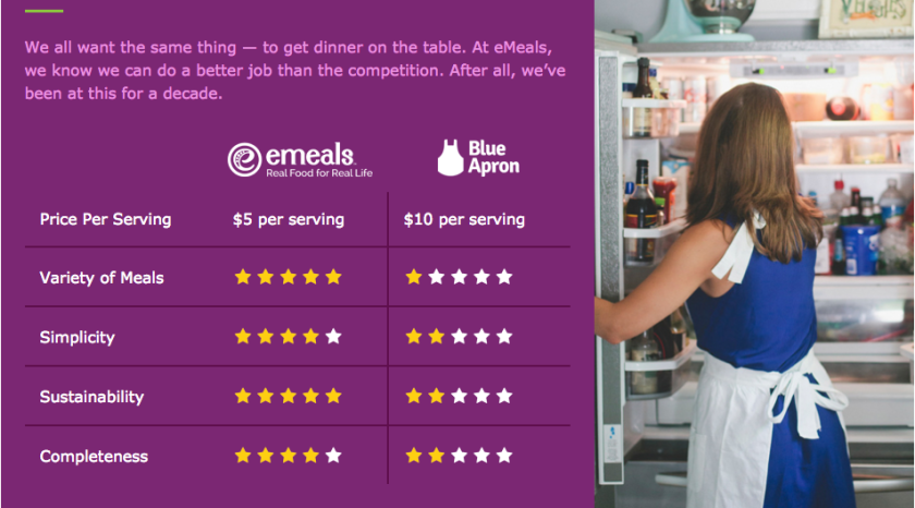
One thing that I didn’t like about the website is the section of the website showing their reviews from customers compared to blue apron. While I think this is a good idea what I don’t like about it is that The girl in the photo that is attached to this section of the page is wearing a very distinctive blue dress. She looks like she’s modeling for blue apron. I can see how they thought the blue would look good with their purple and green color scheme, but the blue in this section of their article was a mistake.
My favorite part of this website was probably the art they had showing how their company works. It was fun to look at, added to the description, and worked perfectly with their color scheme.

Link to this site is: http://emeals.com/lp/emeals-vs-meal-kits/?utm_source=facebook.com&utm_medium=cpc&utm_term&utm_content=fb_newsfeed_meal-kit_variety-pork-tacos&utm_campaign=budget_grocery-high-spenders-visa
